via PRINT Mag:

Comics drawing, aka cartooning, has more in common with typography than with traditional drawing: the drawings in comics are meant to be read, not just looked at...

I tried to teach myself to handletter by looking at examples of 1920s original commercial art, specifically those done for the Valmor cosmetics company, original scraps of which were sold by the Chicago novelty store Uncle Fun and run by Ted Frankel, who had inherited the company's entire back catalog. I learned more from looking at those old inked and whited-out boards than I did from all of the old instruction books I tried to puzzle out, which always seemed reluctant to give up their secrets. These Valmor originals, many of which were by African American artist Charles Dawson, also affected the way I ended up drawing comics, which was to work more typographically than drawing-ly, for lack of a better word.

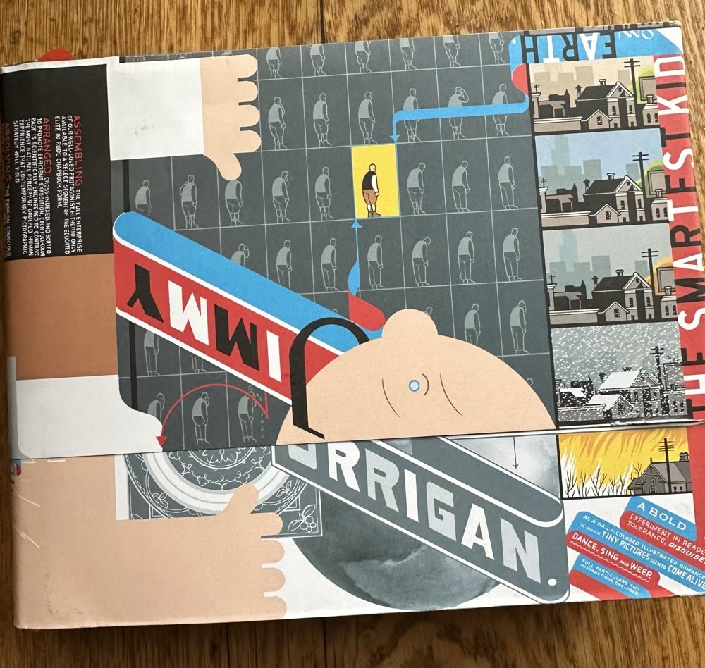
JIMMY CORRIGAN: THE SMARTEST KID ON EARTH (Chris Ware, 2000)

(***** / *****): On something of a Chris Ware kick lately (there are worse to be on), to the point (even) that I resubscribed to the Paris Review, just to re-read their interview with him. At times brutal, particularly the flashbacks to Jimmy's grandfather's upbringing, but always bursting with a spirit of experimentation and an unfiltered love of the medium. Nothing short of (awe)inspiring.
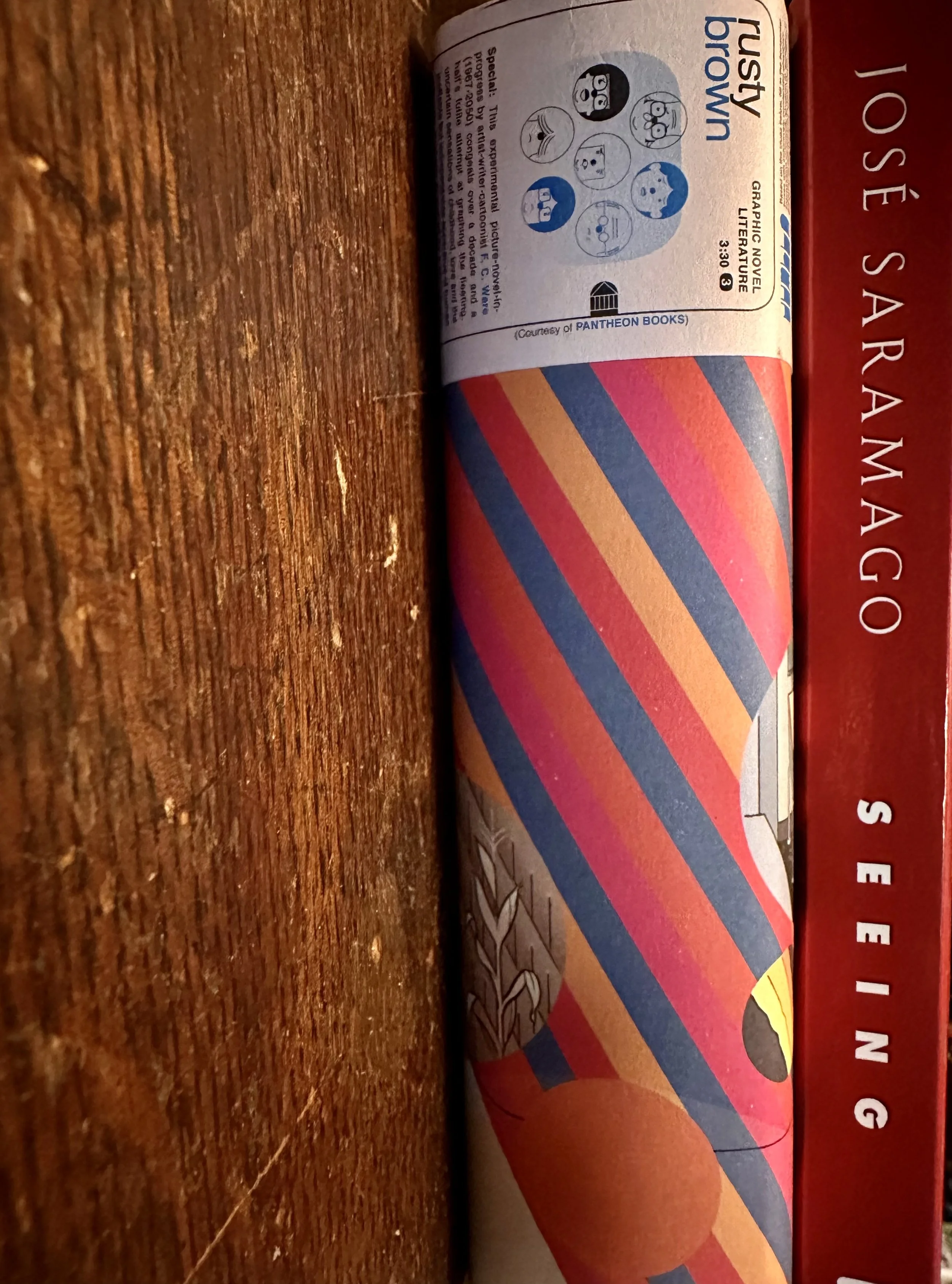
Chris Ware on (lack of) perspective

I avoid the use of perspective because I don’t think it effectively translates the way we remember physical space into the two-dimensional form of ­comics. Isometric projection, which keeps coordinating axes at the same degree, seems to key in to my felt memory better than any mass of as-seen conflicting angles does. Japanese narrative art embraced this approach thousands of years ago. Plus, perspective simply makes the page a mess, and in comics, composition is paramount. 

Art Spiegelman has defined comics as the art of turning time back into space, which is the best explanation of the medium I think anyone’s yet come up with. The cartoonist has to remain aware of the page as a composition while focusing on the story created by the strings of individual panels. I think this mirrors the way we experience life—being perceptually aware of our momentary present with some murky recollections of our past and vague anticipations of where we’re headed, and all of it contributing to the shape of what we like to think of as our life. I try to flatten out experience and memory on the page so the reader can see, feel, and sense as much of all of this as possible, but it’s really not much different from composing music or planning a building.